


C.I Introduction
Introducing GREENON's Corporate Identity (C.I) and providing a download link.
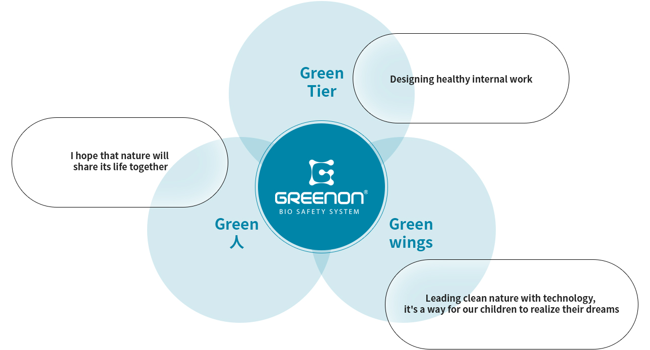
CORPORATE IDENTITY
Make a healthy environment and bring happiness to people,
By fostering a connection that harmonizes with nature, we spread love to a wider community.
The meaning of the company name GREENON
GREENON is the official English name, symbolizing the creation of a bright and green world.
The meaning of the image motif
By forming the initial alphabet 'G' of GREENON with various dots, it coveys the meaning of connecting the world through GREENON's innovative technology.
Wordmark
The wordmark is the element that best reveals
the formative characteristics and symbolism
of GREEN ON.
Since the logo is a key element that represents the GREENON brand, it should be used with caution against distortion and deformation to maintain optimal application conditions when applying.
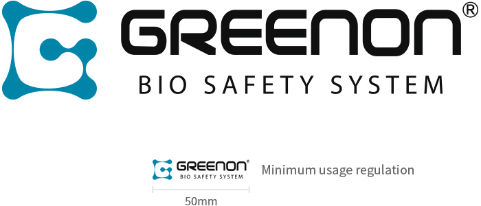
Space Regulations
Since the wordmark is the most important element that expresses the identity of GREENON,
it should not damage the image of the brand
by arbitrarily modifying it, and it should
be guaranteed a space protected from visual infringement by other elements in consideration
of consistent identity and explicitness.
